devket
Start a project
devket
Theme
Start a project

Lighthouse

A premium digital platform for property investment and long-term wealth planning, built to explain a complex advisory ecosystem while establishing trust from the first screen.
Industry
Financial Services
Project type
Corporate Website · Financial Services
Services
Product strategy, UX/UI design, Design system, Frontend development, CMS implementation, QA, Launch support
Technology
Next.js, TypeScript, Sanity, HubSpot, Vercel
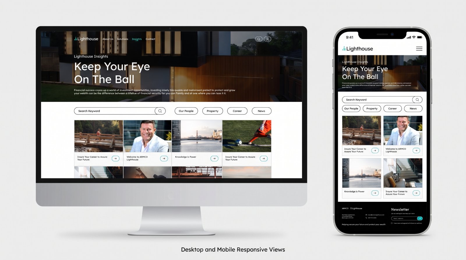
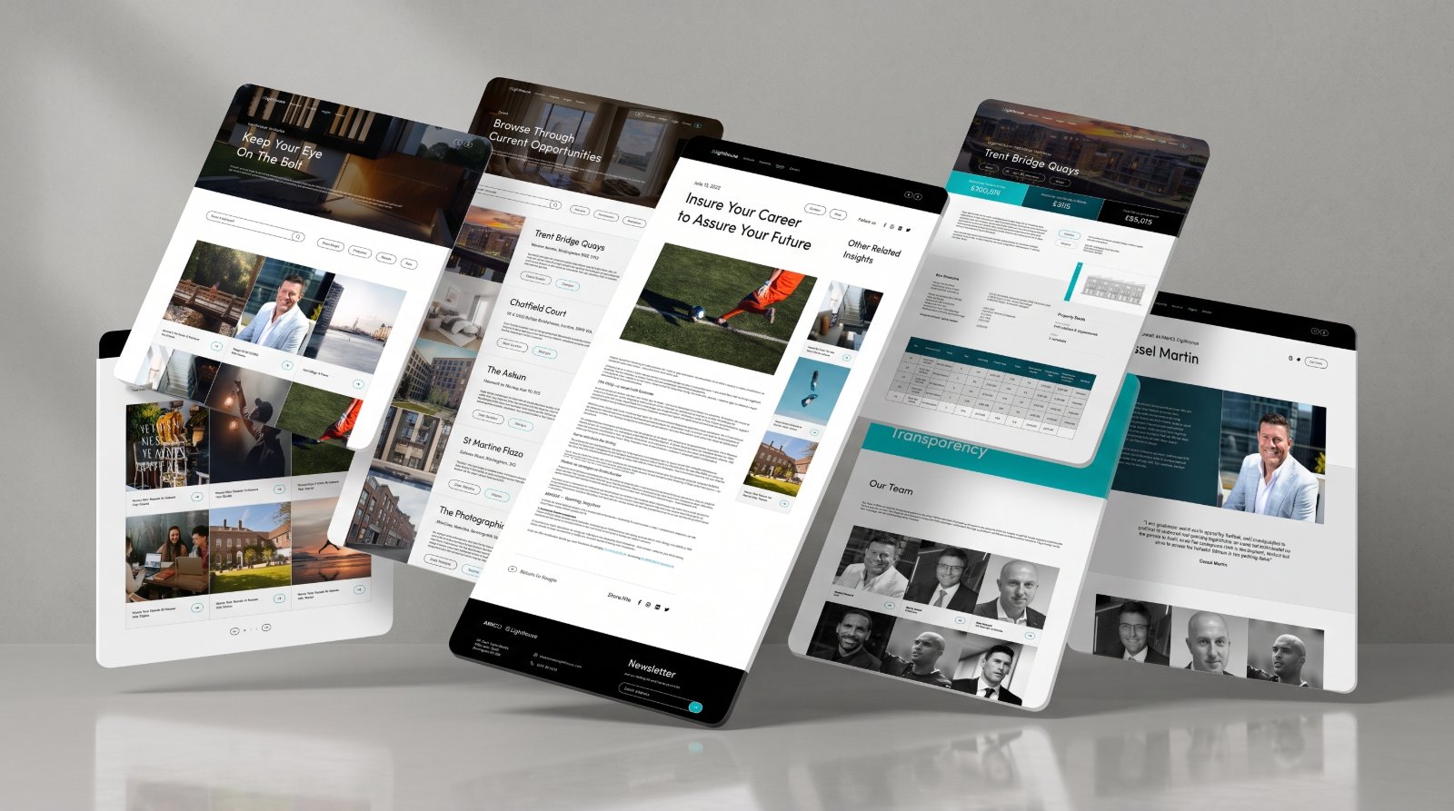
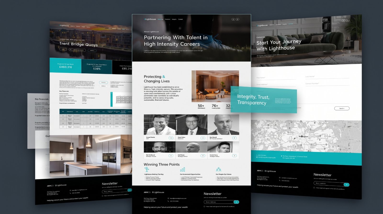
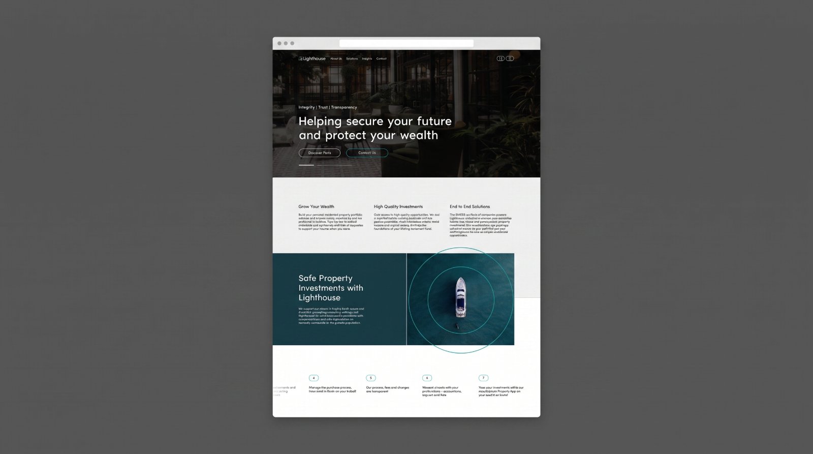
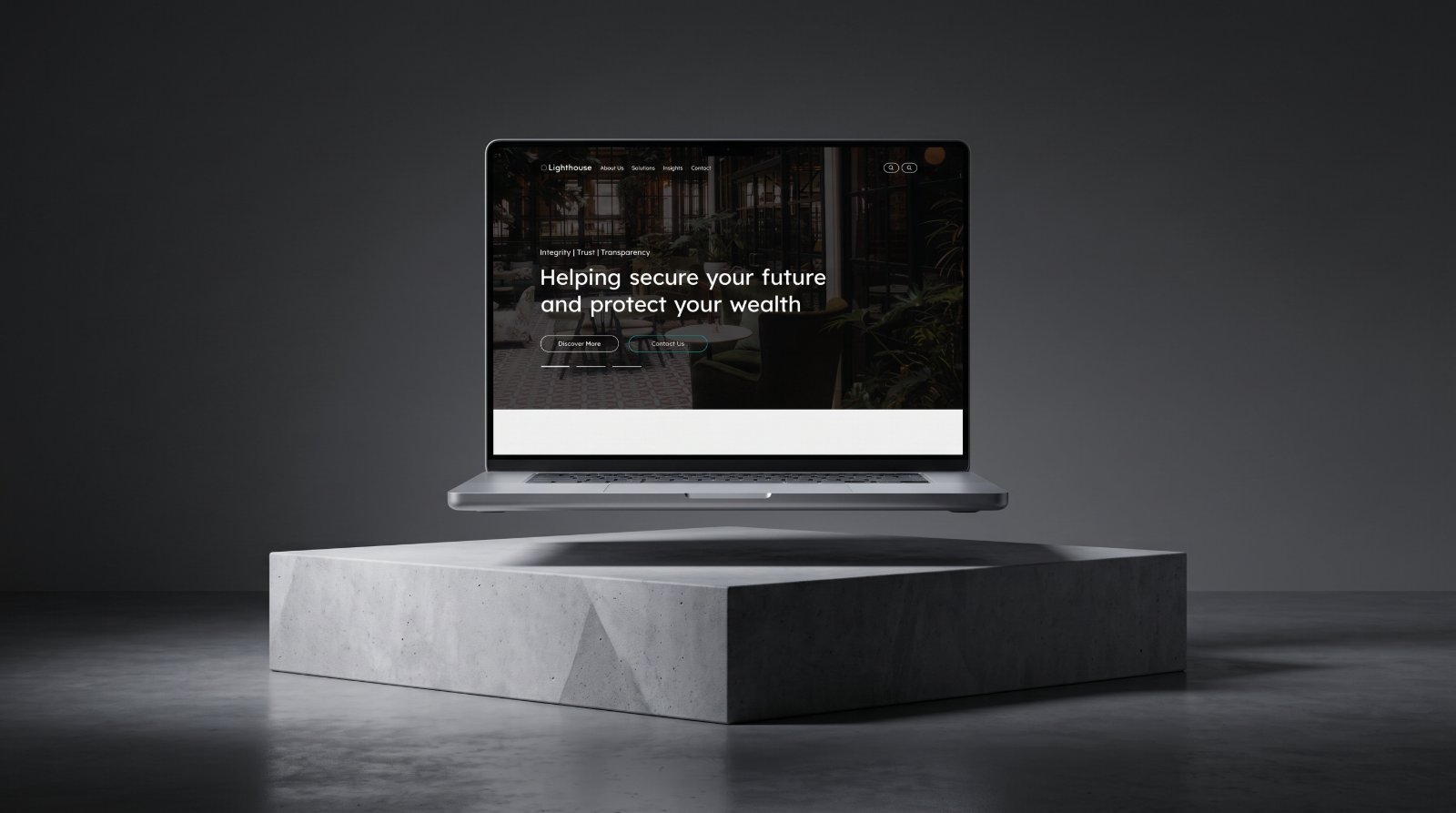
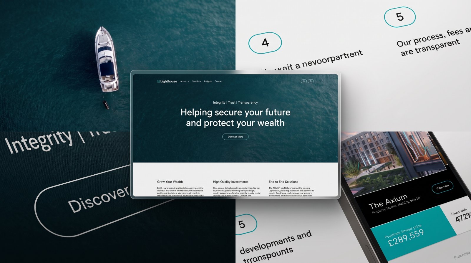
The Lighthouse homepage on a laptop floating above a concrete plinth, showing the Integrity | Trust | Transparency eyebrow and the "Helping secure your future and protect your wealth" headline.A layered composition of Lighthouse interface fragments, the teal hero over open water, numbered process steps, and a property listing on mobile showing The Axium.The Lighthouse Insights page shown side by side on desktop and mobile, with the Keep Your Eye On The Ball hero, keyword search, category filters, and article grid.Five Lighthouse pages arranged as a tilted array, Insights, current opportunities, an article page, a property financials page, and a team profile.Three Lighthouse pages overlapping, a Trent Bridge Quays property page with projected returns, the About page with the leadership team, and the Contact page with an enquiry form and map.The Lighthouse homepage in a browser window, scrolling from the hero into Grow Your Wealth, High Quality Investments, End to End Solutions, and the Safe Property Investments section.
Overview

Lighthouse is a premium digital platform for property investment and long-term wealth planning. Devket approached it as a connected product experience rather than a collection of isolated screens.

Challenge

Lighthouse needed to explain a complex investment and advisory ecosystem while immediately establishing trust. The website had to communicate services, leadership credibility, process, and long-term value without overwhelming visitors.

In financial services, credibility is the product, every layout decision had to reinforce integrity and transparency rather than sell.

Devket’s role
Product strategyUX/UI designDesign systemFrontend developmentCMS implementationQALaunch support
Solution

Devket organized the experience around integrity, trust, and transparency, premium imagery, restrained typography, and structured explanations that make a sophisticated proposition legible.

Trust first

Leadership profiles, statistics, and the related-company ecosystem establish credibility early.

Structured services

The investment process and offerings are explained in clear, progressive steps.

Restrained design

Premium imagery and disciplined typography signal quality without noise.

Clear next step

Insights and contact pathways guide visitors from discovery to consultation.

Product experience

Inside the product

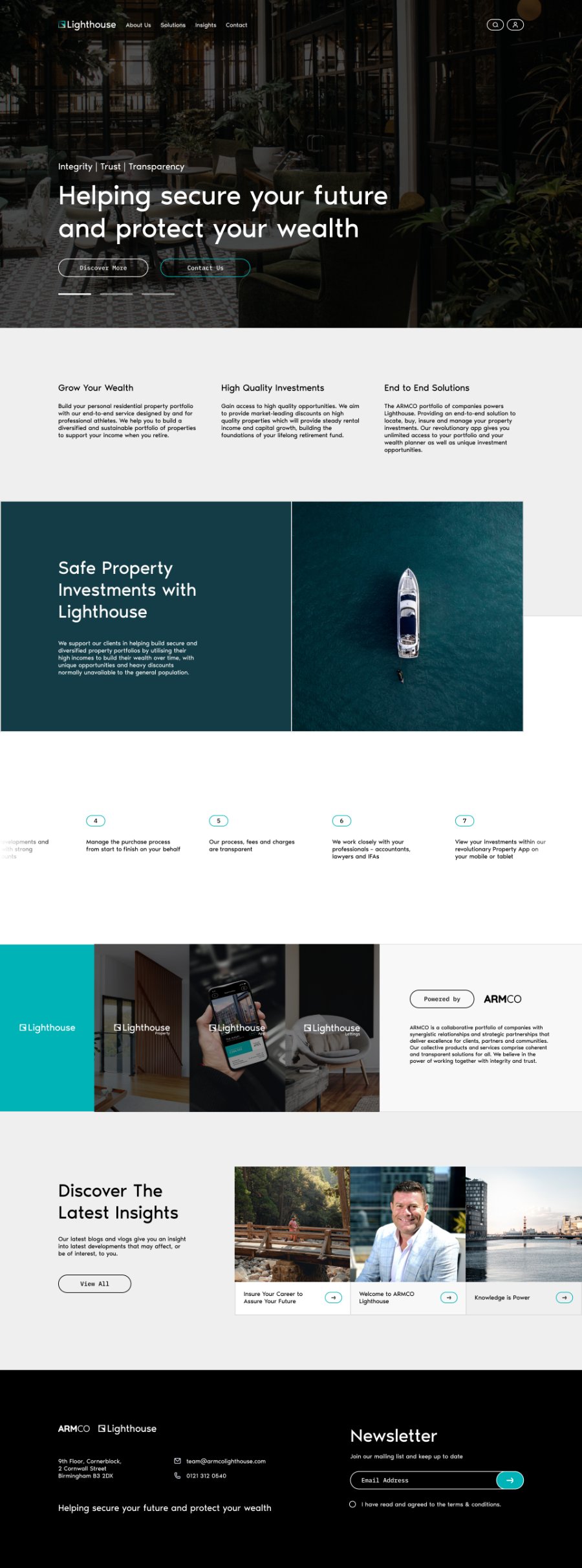
The Lighthouse homepage scrolling from the “Helping secure your future and protect your wealth” hero through the three value pillars, the Safe Property Investments panel, the numbered process, the ARMCO ecosystem strip, and the latest insights.

Corporate homepage

A premium, restrained homepage introduces the proposition and routes visitors toward services, insights, and contact, moving from the hero statement through the three value pillars, the investment process, the ARMCO ecosystem, and the latest insights.
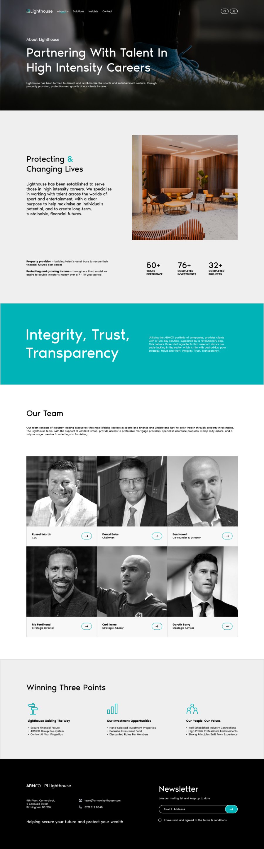
The Lighthouse About page showing the Protecting & Changing Lives section, experience statistics, a full-bleed Integrity, Trust, Transparency panel, the leadership team grid, and the Winning Three Points summary.

Establishing credibility

The About page carries the trust burden: purpose, track-record statistics, the Integrity, Trust, Transparency statement, and named leadership profiles that financial decisions require.
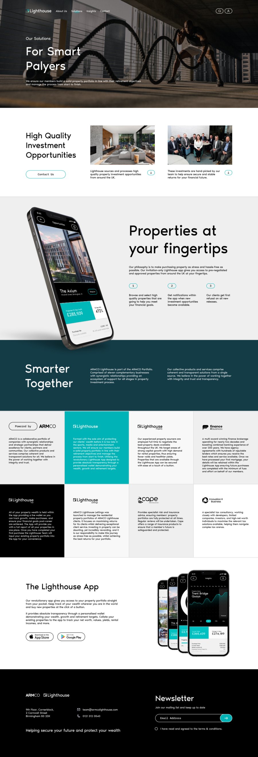
The Lighthouse Solutions page covering high-quality investment opportunities, the Properties at your fingertips app section, the Smarter Together ecosystem grid, and the Lighthouse App download panel.

Services and process

Structured service explanations and a clear investment process make a complex offering understandable at a glance, with the app presented as the thread that connects sourcing, purchase, and portfolio management.
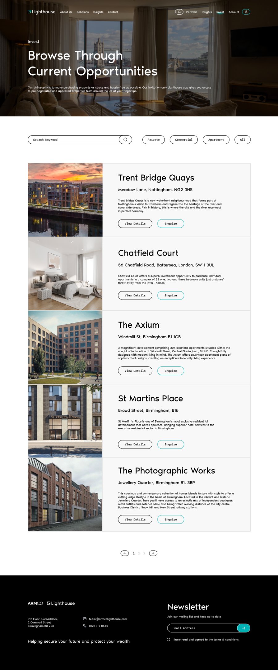
The Lighthouse Invest page with keyword search, Private, Commercial, Apartment and All filters, and property cards for Trent Bridge Quays, Chatfield Court, The Axium, St Martins Place, and The Photographic Works.

Browsing opportunities

The invest index turns a private portfolio into something scannable: keyword search, property-type filters, and consistent cards that lead to detail or a direct enquiry.
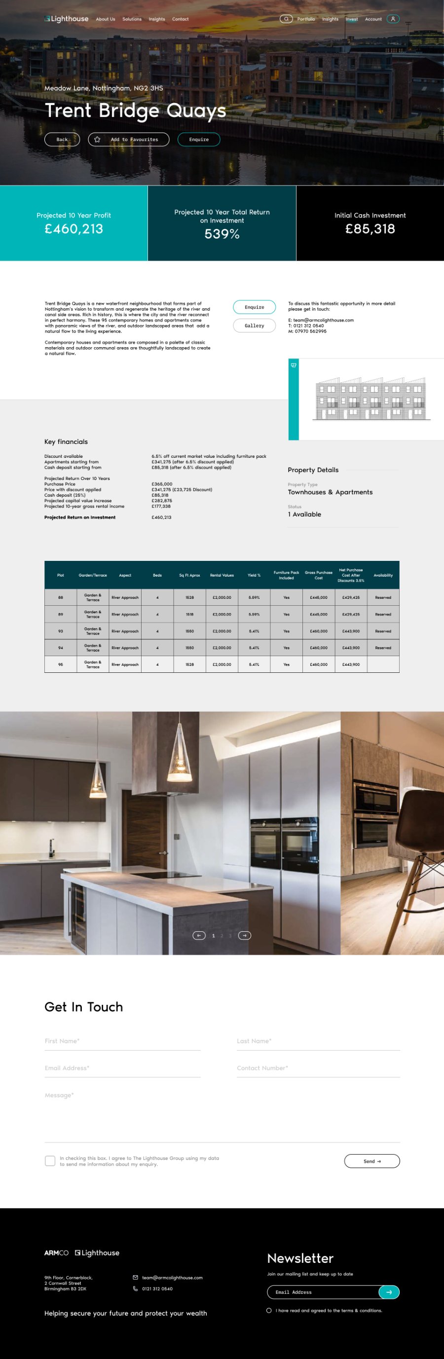
The Trent Bridge Quays development page with a full-bleed hero, the projected profit, return and cash-investment band, key financials, a plot availability table, an interiors gallery, and a Get In Touch form.

Development detail

Each development leads with the numbers an investor needs, projected profit, total return, and initial cash, then supports them with key financials, a plot-level availability table, and gallery imagery.
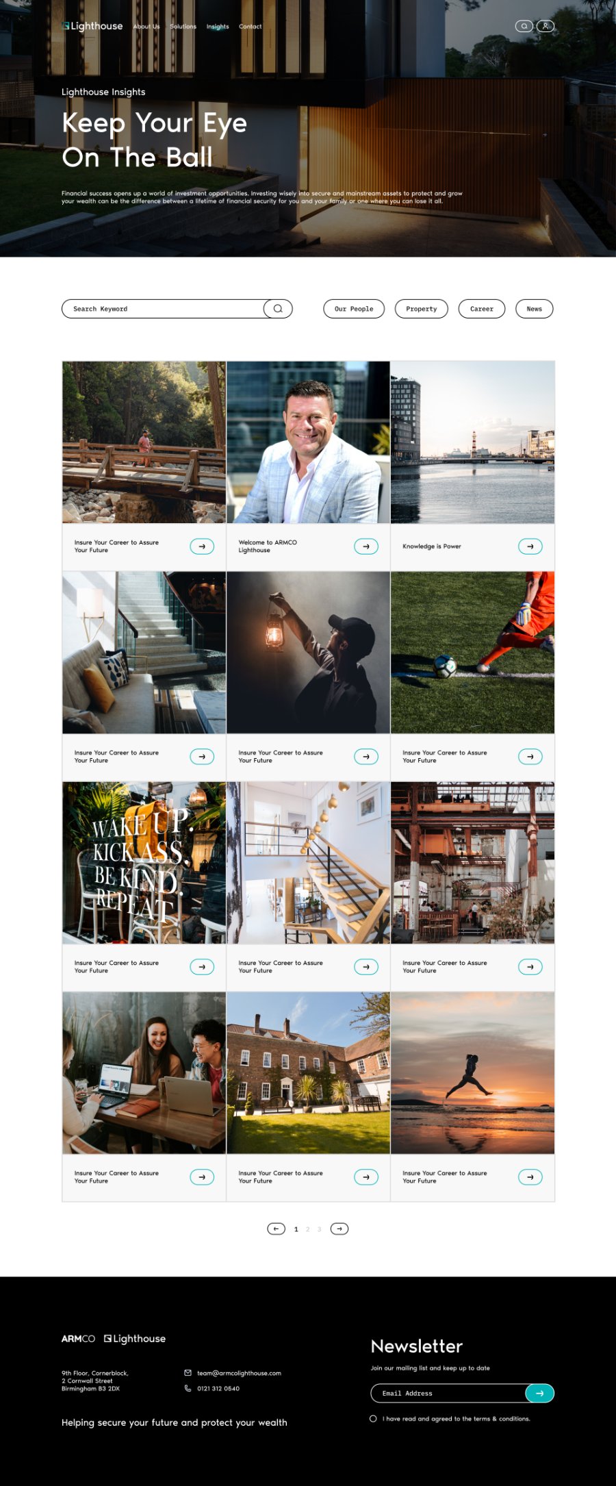
The Lighthouse Insights page with the Keep Your Eye On The Ball hero, keyword search, category filters, and a twelve-item grid of article cards with pagination.

Insights library

A filterable, image-led index keeps long-term engagement alive between enquiries, with categories for Our People, Property, Career, and News.
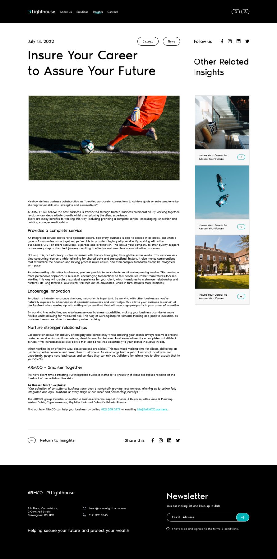
A Lighthouse insight article with date, category tags, a large headline, a feature image, subheaded body copy, an Other Related Insights sidebar, and return and share controls.

Reading an article

The article template keeps long-form reading comfortable, a single measured column, clear subheadings, and related insights plus sharing kept to the margin.
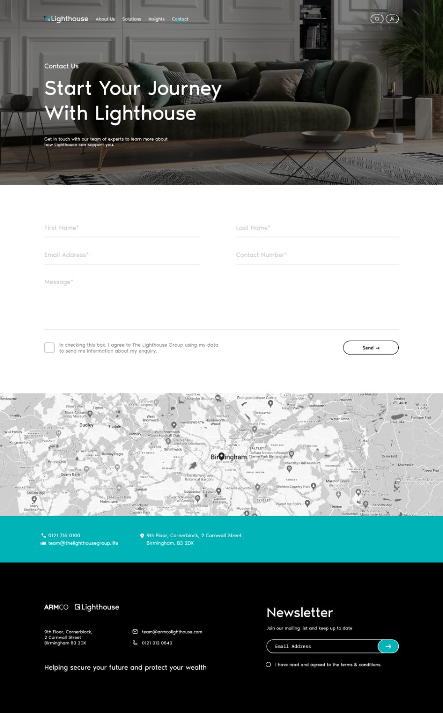
The Lighthouse Contact page with the Start Your Journey hero, an enquiry form with consent checkbox, a Birmingham map, and a teal contact band with phone, email, and address.

Contact pathways

Clear routes from interest to consultation: a short enquiry form, a mapped office location, and direct phone and email details in a single uninterrupted flow.

The Lighthouse Sign In page with a centered logo, email and password fields, a forgotten-password link, and a “Not Signed Up Yet? Take A Tour” button.

Member sign-in

The account gateway stays deliberately quiet, a centered sign-in with a secondary route for prospective members who have not joined yet.

Key features

What makes it work

Corporate homepage

Sets a premium tone and orients visitors immediately.

Service explanations

Makes a sophisticated offering understandable without jargon.

Investment process

Shows how value is delivered, reducing perceived risk.

Leadership profiles

Establishes the credibility that financial decisions require.

Insights & newsletter

Supports long-term engagement beyond the first visit.

Contact pathways

Clear routes from interest to consultation.

Technology

The stack behind it

Experience
Next.jsTypeScript
Application
App RouterSSR
Data
Sanity CMS
Integrations
HubSpotGA4
Infrastructure
VercelCloudinary
Outcome

What changed

A complex proposition made easier to understand
A stronger path from brand discovery to consultation
Credibility established through structure and restraint
Clear service and process communication
A scalable content foundation
A premium presence aligned to the audience
The full story

Go deeper in this case study

Open the full document to read the detailed process, screens, and decisions behind Lighthouse.

Related work

Building something with similar complexity?

Start a project